One of the key aims of the NEXUS project is to explore the extent to which human mobility patterns (e.g. commuting, tourism, migration) can be effectively mapped using social media data. Effective information on mobility is of vital importance to policy makers, yet is often in short supply or is expensive and difficult to collect (take as an example the traffic surveys which are notorious for causing jams, like the one reported on below). If such information could be produced cheaply from already available sources of data, this would be a real boon.
In order to get a handle one whether social media data can be used in this way, we have been collecting geolocated tweets from the UK over the last year or so (see map below). As you might expect they spread out over the UK according to centres of population (left panel). BUT we can also use this data to observe when people tweet from more than one location, which may give us a handle on patterns of movement and traffic (right panel). The image below is using one day’s worth of data. At the scale of the UK, we can see that, even with this very limited data source (as not every tweet is geolocated and many people do not tweet twice a day) there is considerable “signal” in terms of patterns of movement around the country.
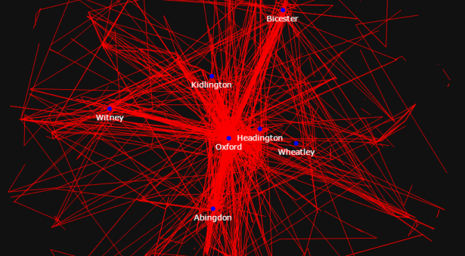
The images below do the same on a much smaller scale, for Oxford. The pattern is what you might expect – peripheral areas connecting largely to the city centre. The question is, do these correlate with commuting patterns which can be observed? This is something we will be exploring as the project progresses.