This post lays out some of the importance of interactivity for network diagrams and we think is well worth a read (or at least a skim!); however, if you wish to skip to the demos, these are linked at the end of the post.
Visualizing network data is a prime example of a research activity where both desktop tools and online libraries exist, but are not well connected with one another. Desktop software like NodeXL and Gephi provide the ability to collect and visualize network data (users on Twitter, videos on YouTube, etc.). These applications, however, provide limited facilities for hosting, sharing, and optimizing visualizations for the web. Numerous technologies, frameworks and platforms exist for displaying network data online, but they often depend on bespoke data formats or a high degree of technical expertise.
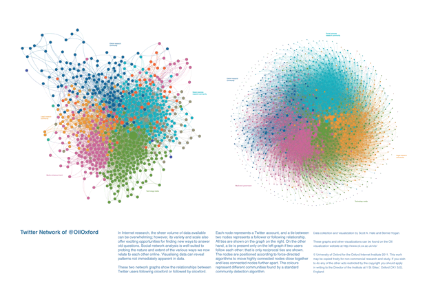
The visualization below shows the Twitter network of the Oxford Internet Institute (@oiioxford), and was produced without a single line of code needing to be written. Data was collected through NodeXL and visualized with Gephi.
However, when trying to share this visualization online, the software we had used to create it left us wanting. The only option readily available was to export as an image and post it to a blog, department website, or gallery. There are numerous practical reasons that this solution was undesirable. For example, it would have been necessary to export at an extremely high resolution to preserve the legibility of the smallest nodes, but this would have created an impractical file size. Also, navigating such a large image file in a web-browser would likely prove awkward and difficult to manage for users, which would limit the intelligibility of the visualization. However, perhaps a more pertinent issue concerns the general usefulness of static network visualizations. When viewed in Gephi or NodeXL, the easy accessibility of node and edge attributes encouraged the data to be explored. These attributes are flattened and reduced to purely visual indicators when a static visualization is created.
Network visualizations like this one seem a prime candidate for interactivity, and indeed great work has already been done with the Sigma.js JavaScript library to enable the rendering of network graphs with HTML5 canvas. This library allows all newer browsers as well as tablet devices and phones to display the visualization without any extra plugins (e.g. Flash) or software (e.g. Java) needing to be installed.
Sigma.js does, however, require knowledge of JavaScript and HTML to produce an interactive network diagram. The amount of knowledge required grows further if the creator of a visualization wishes to provide an infobox with more node information, an ability to search for a specific node, or to change fonts and colours. The library also could be improved in some subtle, but important, ways: we’d like to add the ability to detect when the user positions the cursor over a specific edge, properly handle redrawing on tablets when the visualization is zoomed, and provide the option for edges to be a blend of the colours of the two nodes they connect. We will work to make these changes and provide a hosted wizard to allow a user to easily create and customize the visualization (what attributes of a node should be shown on click, what title and explanatory text should be included, should any edge information be shown on hover, should a search function be included, etc.).
Before the wizard is released, however, we are very excited to release two demo visualizations as examples of what could be produced and customized with the wizard. We’ve tested these visualizations in the latest versions of Safari, Firefox, Opera, and Chrome on Windows, Linux, and Mac, but we consider these to be very much work-in-progress. We’re releasing them to get feedback that we can incorporate into the project. The more specific you can be in describing any suggestions or issues the better. Please at a minimum include your operating system (Windows, Mac, Linux) and browser version.
So, please leave feedback! What works, what’s missing, and what would you ideally change? Leave a comment below or send an email.