The challenge of measuring social network site use
Published on 20 Dec 2011
Written by Grant Blank
Survey research, which is at the core of the OxIS project, presents several measurement challenges. Establishing reliability is especially difficult when measuring concepts where observational data might yield better results, such as usage of different online services. Therefore, the way in which respondents are asked about online activities can have a major impact on the quality of self-reported data. Sometimes a different question wording or different structure of possible answers can yield different results.
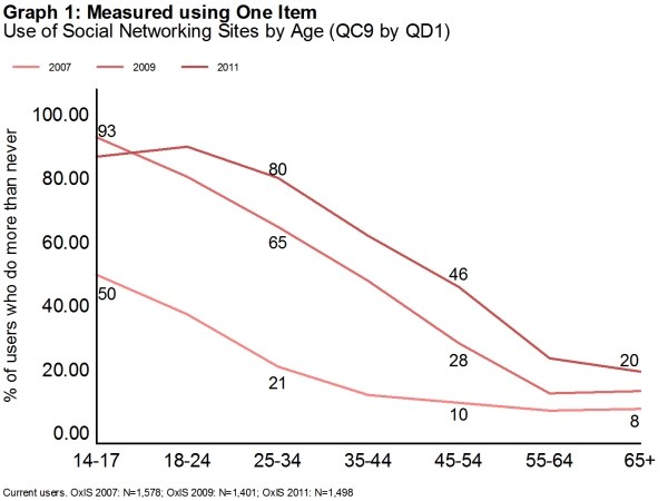
Using OxIS data, we explore this in the case of social network site (SNS) use. We compare levels of self-reported SNS use for two different measurement approaches. The results are reported in the graphs below, where proportions of SNS users among Internet users are plotted by age groups. To produce the first graph, SNS use was measured by a single item reading “How often do you use the Internet to check or update your profile on a social networking site such as MySpace or Facebook?” (QC9.l), where possible answers ranged from “Several times a day” to “Never”. Overall, 60% of Internet users claimed they do so more than never.
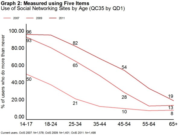
In the second graph, the measure of SNS use for 2011 is responses to a series of five dichotomous items. “[Do you] use any of the following: a. Facebook; b. LinkedIn; c. Twitter; d. An online dating site like eHarmony, Match.com or Zoosk; e. Another social networking site?” (QC35). Any respondent answered “yes” to any of those five items was coded as a SNS user. Using this approach 66% of Internet users reported using social networking sites, about 6 percentage points higher.
The 2007 and 2009 data are the same in both graphs. The only SNS item on the 2007 and 2009 questionnaires was the question “How often do you use the Internet to check or update your profile on a social networking site such as MySpace or Facebook?”
Ever since we began to measure social network site use there has been a strong relationship to age.
When we measure social network site use by several items it is slightly different than when we measure it using a single item.
Comparison of the 2011 lines (dark red) in both graphs shows that two different measures generate different results not only in the overall population but also across age groups. In the Five Item graph, the 2011 line is always above the 2009 line, indicating an increase in SNS use across all age groups, with the biggest jump among 45- to 54-year olds, 26 percentage points. By contrast, in the One Item graph the differences in SNS use between 2009 and 2011 are smaller, the increase among 45- to 54-year-olds is only 18 percentage points. Interestingly, the One Item graph shows a drop in SNS use among the youngest users from 2009 to 2011 and among the oldest it is at the same level in 2009 and 2011.
The above example shows that using different approaches to measuring online activities yields different results and different interpretations. The One Item graph is more consistent with data from previous years. The Five Item graph yields higher percentages and probably more accurate results. This is because asking about all five items focuses respondents on social networking activity and helps them recall all the kinds of social networking sites they visit.
The Oxford Internet Survey is the longest-running academic survey of internet use in Britain, describing how it has evolved from 2003 to the present day.
Research on access, use and attitudes to the Internet in Britain based on biennial surveys covering (for example) digital and social inclusion and exclusion, mobile use, social media, safety and privacy concerns, Internet regulation, and behaviour.