15 Sep 2014
Findings
The map restates the United States’ position as a core geographical focal point of the collection. There are seven location pairs that are characterized by over 100,000 events happening between them. Every one of these seven pairs has one location outside of the United States and one inside the country. The brightest lines connect the United States (and Washington in particular), with Russia (twice), Iran, Iraq, Israel (twice), and China.
It is important to be aware of the scale at which this map should be interpreted. Many of the hotspots on the map are capital cities such as Washington or Moscow, but many locations also appear to be in relatively unpopulated places, such as the American Midwest or the middle of the Australian Great Victoria Desert. This occurs because many actors in the dataset are simply geocoded to a country rather than to a particular city or town. In those cases, the dataset locates them at the geometric centroid of countries. As such, this map is most useful to illustrate broad patterns of connections between regions and countries, rather than micro-connections between specific cities.
Russia, Iran, Iraq, Israel, and China are the countries most connected in general to the United States, along with Afghanistan, each one accounting for more than 500,000 events connecting a location in the United States to a location in one of those countries. The ‘special relationship’ between United Kingdom and United States accounts for over 450,000 events connecting two places on either side of the Atlantic.
The United States aside, the single most active connection between two cities is between Seoul and Pyongyang, with more than 98,000 events recorded in the database. At the country level, North and South Korea are connected by almost 250,000 events. The two most connected countries (excluding the United States) are Afghanistan and Pakistan, accounting for over 425,000 events, almost double the number of events connecting Pakistan and India (about 238,000 events).
The most active relationship in the Middle East and North Africa region involves Egypt and Israel, counting over 385,000 events connecting places in the two countries, followed by the relations between Israel and the West Bank (335,000 events), and between Israel and Lebanon (over 330,000 events). There are about the same number of events connecting Iran and Iraq as the number of events connecting the United States and Canada (about 315,000 events), and almost as many events connecting China and Japan as events connecting the United States and Mexico (about 270,000 events).
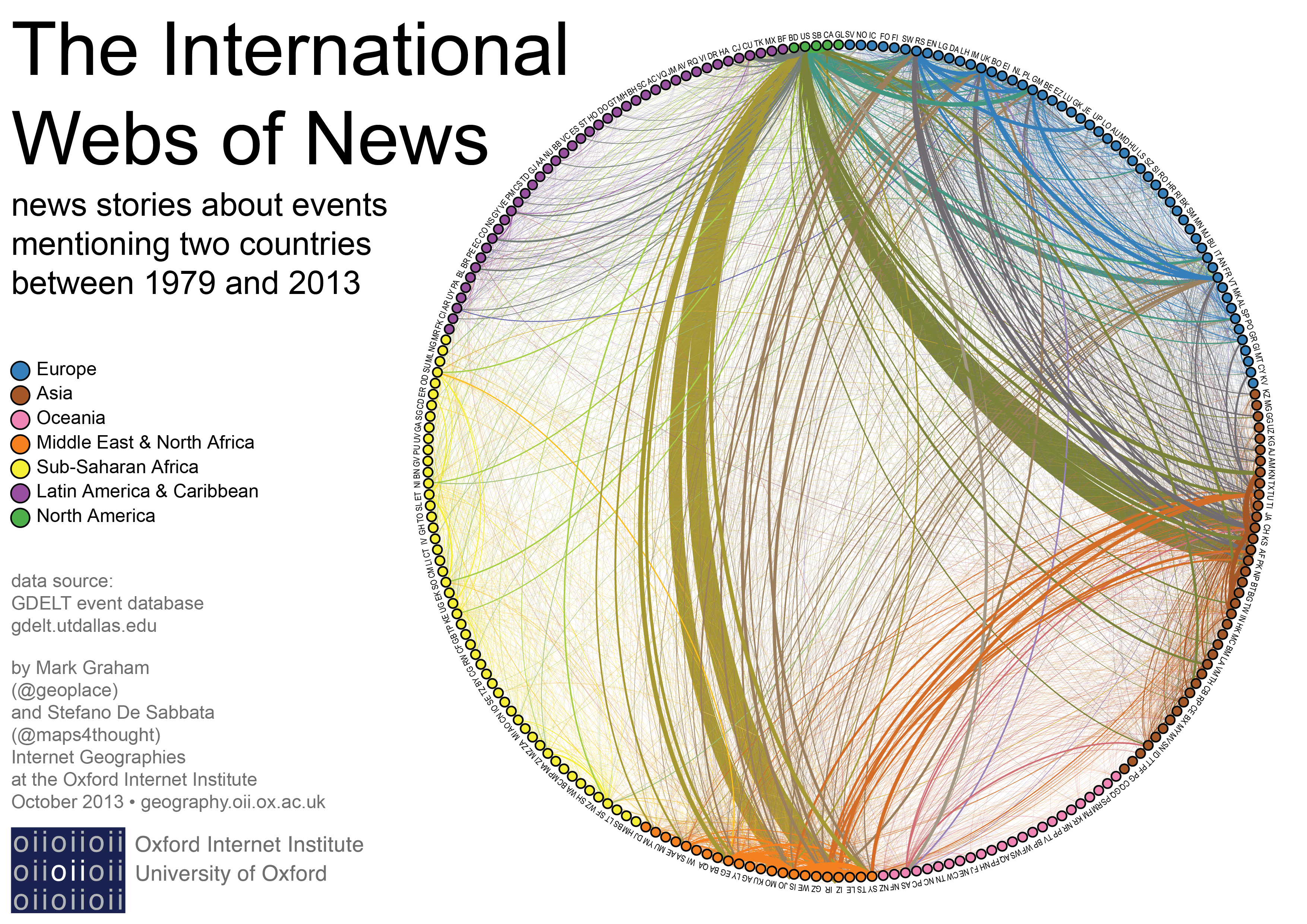
Aggregating data by country, we see that most of the events involving two distinct locations are international events, as only about 5 million events refer to two locations in the same country, whereas about 38 million events refer to locations in two different countries. The second graphic focuses on international events only.
Beyond the connections mentioned above, the second graphic highlights several inter-continental connections. Russia and the United Kingdom are among the most visible European countries, followed by Germany and France. Each one of these four European countries has strong connections with Asia, especially with China, Afghanistan, and Pakistan. A tight cluster is also visible in Asia, centered in China, and involving Hong Kong, Taiwan, South Korea, and North Korea.
Russia, the United Kingdom, Germany and France also have very visible connections with countries in the Middle East, in particular with Syria, Israel, Iran, and Iraq. The bright orange lines originating from Turkey also point to that country’s connections with a handful of Middle Eastern countries.
Sub-Saharan Africa is visibly the most disconnected of the seven regions. There are a few lines connecting Sub-Saharan African countries to the United States and the United Kingdom, and a few that link Sudan with its neighbour Egypt. Otherwise, we see very few connections. A similar pattern is evident in Latin America and the Caribbean, although the connections to the United States are stronger, especially those involving Mexico and Cuba.
The media inevitably present us with particular biases and objects of attention. This work is designed to show you both the locations and connections present in hundreds of millions of news stories from around the world.
Data
The map uses data from the Global Database of Events, Language, and Tone (GDELT), which is an initiative aiming to provide a “realtime social sciences earth observatory”, by creating a freely available catalog of events derived from news stories. The database is compiled from stories in media outlets from almost every country in the world. Any story can contain more than one event, and events are automatically parsed out of news stories using a text analysis program called Tabari and encoded using a schema called Cameo.
A large portion of these events (140 million out of 250 million listed events) contains both a location of where the event happened and locations of the two primary actors involved. The Tabari algorithm associates events that it has already picked out of an article with geographic locations mentioned in the same text (by looking at verb usage in surrounding sentences). You can read the introductory paper on GDELT (Leetaru and Schrodt, 2013) for more on the specific geocoding methods employed.
We exclude all events where the two actors are geo-coded as being located in the same place (about 91 million events, or 36 percent of the full dataset), and location pairs referred to by fewer than 10 events (about 7 million events). This left us with about 43 million events (17 percent) and 216,000 connections between location pairs to visualize in the map.
The first map illustrates all the connections between pairs of locations. The brightness of each line reflects the number of events connecting the two places. The second graphic focus on international events, grouping the connections by country. Colour is used to map the world’s regions and the connections between them, with colour assigned to the ‘edges’ (i.e., connections) based on the colours of the two connected nodes. The thickness of the lines represents the number of events.
Note: in the second graphic below, “Countries, Dependencies, Areas of Special Sovereignty, and Their Principal Administrative Divisions” are labeled according to their classification in the GDELT database, using the FIPS 10-4 codes.