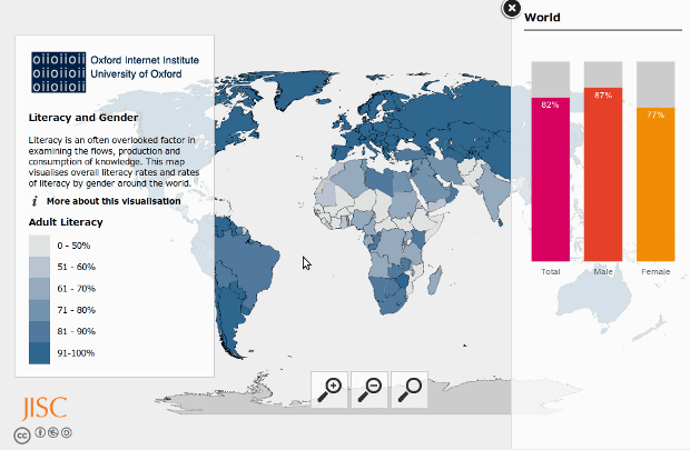
Behind every visualization is data. After some extensive internal testing we are preparing to release a wizard to create map visualizations next week. This wizard will require the data in spreadsheet form as a Google Spreadsheet. (We’d welcome suggestions on future formats and sources). An example of the data for the current visualization on literacy is available as a Google Doc for you to view and adapt to your own data. The first two columns are required along with at least one additional column of data. The first column is a country code (e.g. ES for Spain) while the second is the label to display when this country is clicked (e.g. Spain or España). Any additional columns are custom columns to hold data to shade countries by or to display as a bar graph or text label in the right-hand panel. There is a row for each country for which data is available. If all data points are unavailable for a given country, it is safe to delete the row for the country. Lastly, it is optional to add a “world” row which is optionally shown when the visualization first loads.
So, open the spreadsheet on Google, save it to your account, and change the data to your own in preparation for creating your own map visualization next week! Lots of data that could be displayed is at the CIA World Facebook or at the World Bank if you need inspiration.
Data
Resulting Visualization (updated and slightly different from image below)


