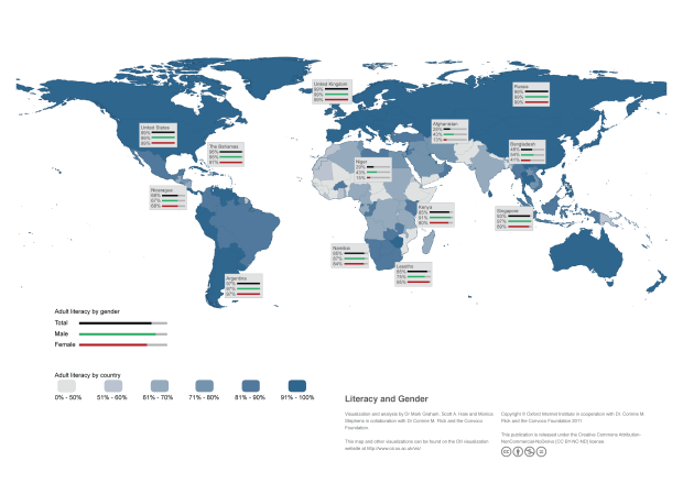
After converting the above data to tabular form, it was possible to produce a map with each country shaded according to one attribute (such maps are called choropleth maps). These can be produced as static images with desktop software including the commercial application arcGIS or the open-source alternative qGIS. The CIA literacy data, however, has three statistics per country: total literacy, male literacy, and female literacy. With static images, it could be possible to show these three statistics on three separate maps or to use shading with a bar chart on top of each country. Neither of these solutions is ideal, however. Separate maps are sometimes difficult to compare, while the use of bars for every country quickly makes the map too crowded. On the earlier static image of this data shown below, we compromised by including the break down by gender for only some countries.
The static image, however, is less than ideal. Exact numbers and gender breakdowns are only available for a small number of countries that the authors selected. In addition, the colours of the smallest countries are harder to see. So, whether it’s literacy, internet usage, income, tweets, Wikipedia edits, or another statistic, interactivity is a key way to allow the user to get exact numbers, view smaller countries, and see a break down of additional information for every country. The additional information in this example is male and female literacy shown with bars, but it could be a line plot showing change over time or text information.
So, without further ado please find below a demo visualization of what we’d like to allow users to produce and customize with a future web-based wizard. We’ve tested this visualization in the latest versions of Safari, Firefox, Opera, and Chrome on Windows, Linux, and Mac, but we consider it to be very much a work-in-progress. We’re releasing it to get feedback that we can incorporate into the project. The more specific you can be in describing any suggestions or issues the better. Please at a minimum include your operating system (Windows, Mac, Linux) and browser version.
So, please leave feedback! What works, what’s missing, and what would you ideally change? In addition, what options need to be supported for the right side pane besides bar charts? Leave a comment below or send an email.