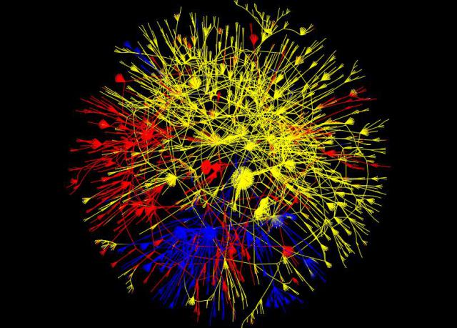
I recently revisited the data I collected last year following the January earthquake in Haiti. I found a new visualization package, Tulip, and was able to successfully visualize the largest connected component of my network. The result and a description follow:

This diagram represents 5,703 blog posts about the Haitian earthquake and the links between them in the largest connected component of the network. Blog posts are in English (yellow), Spanish (red), and Japanese (blue). The nodes are positioned using a force-directed GEM layout in Tulip.
The overall network consists of 113,117 blog posts collected in a 45-day period following the earthquake. Only about 5% of the links connect posts of different languages. Of these, most link from personal blogs in Japanese and Spanish to media and professional blogs in English. About 1% of links contain human translation of the blog content. Significantly fewer cross-lingual links originate in English posts than in Spanish or Japanese posts.


